Showing posts with label Picturebooks. Show all posts

Monday, May 9, 2011

Crow Call


Written by Lois Lowry

Illustrated by Bagram Ibatoulline

I was fortunate to have stumbled upon Lois Lowry’s, Crow Call, as I was looking through the picture book section for another book written by an “L” author.  I did not realize Lowry had ever written a picture book—and realized later through her website that this was her first.  I was immediately drawn to the book because there was something about the title and the illustrations on the front and back cover that reminded me of one of my favorite picture books, Owl Moon, written by Jane Yolen. 

Through the story of Crow Call, Lowry retells a true story from a childhood—an early morning when she went crow calling with her father in 1945 after his return from World War II.  Early on, we realize that the young girl is rebuilding her relationship with her father and hardly feels like she knows him anymore.  She says, “I practice his name to myself, whispering it under my breath.  Daddy.  Daddy.  Saying it feels new.  The war has lasted so long.  He has been gone so long.”  Later, the father asks, “What’s your favorite thing to eat in the whole world?”  The young girl responds, ““Cherry pie.”  I admit.  If he hadn’t been away for so long, he would have known.”

As the story continues, the young girl Liz becomes more and more comfortable with her father.  Similar to Owl Moon, Crow Call shows the powerful relationship between father and daughter and the importance of bonding.  The story is told through the perspective of the young girl, and Lowry incorporates a lot of dialogue between the young girl and her father in addition to the young girl’s innermost thoughts.  For example, a conversation about war: ““Daddy,” I ask shyly, “were you scared in the war?”  He looks ahead, up the hill, and after a moment he says, “Yes.  I was scared.”  “Of what?” “Lots of things.  Of being alone.  Of being hurt.  Of hurting someone else.”  “Are you still?”  “He glances down.  “I don’t think so.  Those kinds of scares go away.””  What a powerful conversation for the two of them to be having—it provides a chance for Liz to get to know her father on a deeper level—and a chance to understand an aspect of war.

Lowry writes using poetic and descriptive language.  For example, “I try not to laugh, wanting to do rabbits next, but I can’t keep from it.  He looks so funny, with his neck pulled away from his shirt collar and a condescending, poised, giraffe look on his face.”  We can visualize this special moment where Liz’s father is being silly making a giraffe call and we feel the warmth of the relationship between the father and daughter.  Also, “I want to scamper ahead of him like a puppy, kicking the dead leaves and reaching the unknown places first, but there is an uneasy feeling along the edge of my back at the thought of walking in front of someone who is a hunter.”  We can now sense Liz’s uneasiness as she relates to her father being a hunter in the war.

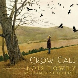
As Liz and her father approach the woods, Ibatoulline creates tension through his full-bleed, double-paged spread illustrations.  The full-bleed illustrations keep us at a close-distance.  Just like in Owl Moon, we feel like we are intruding on this very special moment between a father and the daughter.  The perspective of the illustrations does change throughout the book.  At times, we are close enough to hear the conversations of the characters.  At other times, we are watching from as if we are an animal peeking from their burrow. 

The colors throughout the story make readers think of fall—shades of brown, black, and light blue saturate each page.  The trees are bare in the woods, reminding us that winter is on its way.  The trees mostly consist of diagonal lines—again creating tension and evoking emotion in the reader.  The representational style of the illustrations reminds us that this story is real as we can sense the subtleties in the expressions of the characters and understand their feelings.

Although this story is nostalgic of an event in Lowry’s childhood, I feel it is relatable to anyone—young or old.  Children today are still faced with losing their fathers to war.  Many fathers do come back, but the bond between father and daughter must be recreated in order to make up for the time that has been lost.  Lowry’s Crow Call reminds us all what it is like to get to know a loved one for what seems like the first time.

Born Yesterday: The Diary of a Young Journalist


Written By: James Solheim

Illustrated By: Simon James

Have you ever wondered what goes on in the minds of babies?  What are they really thinking when they suck their thumb?  What makes it appealing to them to stick their fist in their mouths or bite their ankles?  The story of Born Yesterday: The Diary of a Young Journalist, written by James Solheim, is a journey kept by a newborn baby in the first year of life.  Everything is written from the baby’s perspective and it is for lack of a better word—hilarious.

For example, on March 22nd the baby writes, “Finally—I have it figured out.  Some things are noses, some are taxicabs, and some are Belgians.  The up end of people is their hairstyles and the down end is their tootsie-wootsies.  These tootsie-wootsie things are fascinating.  I plan to write a book about them. My sister paints her tootsie-wootsie nails a special color called striped.  I can’t wait till I can paint my tootsie-wootsie nails the color called striped, and thus become a super-chick person like my sister.  For now, I just lift them to my mouth and suck.”

The illustrations in the story are simple and are very cartoonish.  The cartoon-looking characters add to the overall mood and humor of the story and the brightly colored watercolors attract the eye—making it perfect for young readers.  The pages are made to look like lined paper, giving the appearance of a real diary.  The illustrations are dispersed throughout the pages and are drawn as vignettes—adding meaning to the text surrounding it. 

A book review by Booklist on Amazon did not give Born Yesterday a positive review simply because the reviewer felt that some of the humor in the book may be over the heads of the intended age group.  The intended age group for this book is ages four through eight.  I do agree that this story will mostly appeal to children in the upper level of the age group because they will better be able to understand the humor—especially if they are an older brother or sister to a new baby in the household.  I read this story to my third-grade students and found that they were all rolling on the floor with laughter—actually, they thought it was much funnier than I had originally anticipated.

The Yellow Star: The Legend of King Christian X of Denmark


Written By: Carmen Agra Deedy

Illustrated By: Henri Sorensen

The Yellow Star: The Legend of King Christian X of Denmark, written by Carmen Agra Deedy, is a powerful story of heroism, strength, pride, and unity.  During World War II, the Nazis invaded Copenhagen, Denmark.  King Christian X was said to be a strong leader who stood strong for his people.  As told in the legend, the Nazis ordered anyone who was a Jew to wear a yellow star to be visible at all times.  The people of Denmark were frightened because they had heard stories of Jews being taken away once they wore the yellow star.  King Christian X decided that all of Denmark would wear yellow stars in order to protect the Jews. 

Carmen Agra Deedy begins her story with a strong and intriguing lead.  “Early in the year 1940, in the country of Denmark, there were only Danes.  Tall Danes.  Stout Danes.  Old Danes.  Silly Danes.  Cranky Danes…and even some Great Danes.”  Deedy immediately catches the attention of readers and makes them want to continue reading.  Deedy also uses the technique of making a long story short in order to maintain the interest of young readers while providing enough information to give understanding.  For example, when letting readers know that the Nazis invaded Copenhagen, Deedy writes, “Soon Nazi solders gathered like dark clouds at the Danish border.  Their arrival in Copenhagen brought food shortages, curfews, and a new flag, which was hung at the palace.”

Deedy’s repetitive words and phrases throughout the story emphasize their importance.  For example, “If King Christian called on the tiny Danish army to fight, Danes would die.  If he did nothing, Danes would die.”  The emphasis is on King Christian’s dilemma—that regardless of what he did in order to solve the problem, Danes would die.  Deedy emphasizes the unity of the Danes when she states, “…there were only Danes.  Tall Danes.  Stout Danes.  Old Danes.  Silly Danes.  Cranky Danes…and even Great Danes.”  Deedy writes her story using simple, yet poetic text that is very easy to follow and understand.  For example, “The terrible news arrived quietly, with leaflets that fluttered down on the city of Copenhagen.”  She creates an image in our minds of people spreading both the news and their worry.   

Danish illustrator Henri Sorensen paints in a style that is both representational and impressionistic.  This combination of style is able to evoke strong emotions from readers.  At some points in the story, he illustrates with fine details—particularly in the faces of the people of Copenhagen.  Readers can see the fear and the worry in their eyes.  It is at these points where we are pulled in emotionally to the scenes.  In the beginning and the end of the legend, where there are only Danes, his style is more impressionistic—emphasizing light and movement over the fine details.   Sorensen also shows powerful images of war, which he illustrates in shades of black and white.  These colors help to distance the reader from the horror of war—as we see images of tanks, sinking ships, and groups of Jews walking towards Concentration camps.   Overall, the illustrations are paintings that look as though they should be on display as artwork—he is an unbelievable artist.

The Yellow Star is perfect to use in conjunction with Lois Lowry’s, Number the Stars.  The setting of Number the Stars is in Copenhagen, Denmark, in the same time period as The Yellow Star.  The legend of Christian X is a further extension to the character portrayed in Lowry’s novel.  Lowry does a phenomenal job of portraying the setting of Copenhagen accurately in her novel.  Having the background information from Number the Stars makes The Yellow Star all the more powerful.

Carmen Agra Deedy includes an Author’s Note in the back of the book that explains the authenticity and accuracy of the legend.  She mentions that unfortunately, there is only unauthenticated proof that the story of King Christian X and his legendary defiance ever occurred against the Nazis.  Deedy gained much of her perspective on the setting of Copenhagen from Lois Lowry’s, Number the Stars.  Through Deedy’s research, she did find that King Christian X did ride through the streets of Copenhagen without guard, no Jews were ever forced to wear the yellow star, Denmark was one of the only places that rescued the majority of its Jews, and the king did support the Danish Jews.

Although only a legend, through her Note, Deedy encourages us to think what would have happened if every Dane had worn the yellow Star of David in order to protect the Jews.  She further encourages us to think about what would happen if we could still follow the same example.  She states, “What if the good and strong people of the world stood shoulder to shoulder, crowding the streets and filling the squares, saying, “You cannot do this injustice to our sisters and brothers, or you must do it to us as well.””  Deedy leaves us with the powerful question, “What if?”

Weslandia


Written By: Paul Fleischman

Illustrated By: Kevin Hawkes

Wesley is an outcast from the civilization around him.  He does not like pizza or soda, he thinks professional football is stupid, and he refuses to shave half his head like the other boys have done.  His parents are worried about him, but Wesley has accepted the fact that he is different, and does not care what other people think of him.  As a result of a summer project, Wesley ends up creating his very own civilization, which he rightfully names, Weslandia.  Through it all, Wesley proves that it is all right to be different.

Fleischman’s creativity is richly evident in this picture book that opens our eyes to the world of fantasy.  Fleischman’s descriptive style allows readers to create vivid images in their mind.  For example, he describes Wesley’s newly created clothing as, “Unlike jeans, which he found scratchy and heavy, the robe was comfortable, reflected the sun, and offered myriad opportunities for pockets.”  He also notes the change and curiosity in Wesley’s tormenters, “His schoolmates were scornful, then curious.  Grudgingly, Wesley allowed them ten minutes apiece at his mortar, crushing the plant’s seeds to collect the oil.”

Illustrator Kevin Hawkes, who also pairs with Fleischman in the creation of Sidewalk Circus, creates full-bleed, double-paged spread illustrations that are saturated with vivid colors.  Bright shades of orange, yellow, green, red, and blue jump off the page and bring the illustrations to life.  Just like in Sidewalk Circus, Hawkes brings our attention to different perspectives.  For example, in the beginning of the story we are invited to watch the magic begin as seeds blow into Wesley’s newly plotted yard.  The moving curtains, light, and trees give us the sense of movement and we sense that the story will unfold.  As Wesley’s civilization begins to develop, we are insiders to all of the fascinating secrets of Weslandia.  We feel as though we are sitting amongst the tall stems of the plants right along with Wesley.  Throughout the entire story, the illustrations help us to sense Wesley’s happiness and success.

At the end of the story, we find that Wesley has created a new language complete with an 80-letter alphabet.  We can see that Hawkes has clued us in to this special language with an emphasis on the number eight by illustrating the endpages in what we can only assume is the Weslandian language.

Once again, Fleischman shows his versatility as an author as he takes readers through the eventful journey of a boy who everyone will come to admire.  It was interesting to find out on Fleischman’s website how his childhood related to Wesley’s.   Fleischman does relate to Wesley on some levels.  He did feel different from his peers because he was the shortest boy in his class all the way through tenth grade.  He also made up an alternate world with his friends—just like Wesley.  Unlike Wesley, however, Fleischman says that he wasn’t an outcast and had a great group of friends.  Regardless of how Fleischman’s inspiration of Weslandia came to be, this imaginative story captures the attention of all those who read it.

Smoky Mountain Rose: An Appalachian Cinderella


Written By: Alan Schroeder
Illustrated By: Brad Sneed

“Now Lis’en.  Smack in the heart o’ the Smoky Mountains, there was this old trapper livin’ in a log cabin with his daughter.  One night, while Rose was fryin’ a mess o’ fish, the trapper, he starts lookin’ dejected-like.  “I reckon it’s hard on ye, not havin’ a ma,” he said.  “Tell me, Rose, would ye lak me to git hitched again?  There’s a widow woman with two daughters down the road a piece.  Way I see it, we’d all fit together neater’n a jigsaw.”

And with that, the story of Smoky Mountain Rose begins.  Author Alan Schroeder bases this sidesplitting tale on Charles Perrault’s, “Cendrillon.”  Perrault’s tale is one of the most popular versions of the classic Cinderella and is the one that most Americans are familiar with.  Schroeder kept many of the familiar elements of Cinderella in his version, Smoky Mountain Rose: An Appalachian Cinderella.   For example, the glass slippers, evil stepsisters, and the midnight curfew are all a part of Schroeder’s tale.  He also kept the overall plot the same—although, he did change the ending a bit by telling readers that Rose and Seb are still living happily ever after to this day—as they are sitting on a swing happily in their old age.

Although many of the classic elements of Cinderella are the same, the variations he made are what made this version special.  For example, a prince would be quite unrealistic, so instead, Schroeder created Seb who was a, “real rich feller—made his fortune in sowbellies and grits.”  Instead of having a fancy ball, Seb hosts a party—a shindig if you will.  To give the country feel, Smoky Mountain Rose’s godmother is a hog—and her carriage was made from mushmelon. 

Another difference in this tale is that the stepmother and stepsisters recognize Smoky Mountain Rose when she arrives at the party.  As they watched Rose and Seb having a great time, “Gertie and her two daughters stood off to the side, madder n’ blazes.  “Look at her,” sneered Gertie, “sashayin’ round lak she’s the belly o’ the ball.  I’ll fix her when she gits home—giver her a list o’ chores she won’t never finish.”  Similar to the Disney version; however, the stepsisters do have a change of heart once Seb and Rose get married.

The language and dialogue of this story is what makes it so comical.  This is definitely a book that needs to be read aloud in order to appreciate the full humor of the story.  Most reviews for this version were very positive; however, there were two reviewers on Amazon that did not appreciate the book at all.  One reviewer stated, “This book is a mockery of Southern Appalachian people.  Not only is the dialogue incorrectly conveyed, but the pictures are demeaning as well.”  Another reviewer writes, “The dialect is less Appalachian and more like something straight from an episode of the Beverly Hillbillies.”  It appears as though one reviewer is from West Virginia and the other does not specify.  Without being a cultural insider myself, it is hard to say whether or not this book is overall offensive to the Appalachian people.

The brightly colored illustrations by Brad Sneed are unique and expressionistic.  The figures are drawn very angular and disproportionate.  For example, the characters have narrow upper bodies and tall skinny necks, but have very wide lower bodies.  Sneed also uses a lot of perspective in his full-bleed illustrations.  Sometimes, we are brought in close to the action and other times we are kept away—but we are always kept close to the action through Sneed’s use of angles.  A reviewer from the School Library Journal writes, “The paintings are realistically rendered but slightly distorted figures are elongated and angular, features exaggerated, and perspectives askew. People are clad in fashions of the 1940s and the lush Appalachian landscape is always in evidence. The fanciful, but decidedly quirky artwork effectively informs readers, in case they didn't already know it, that there's magic in them thar hills.”  Booklist writes, “Sneed's watercolors are rich and intense; his angular lines draw readers into the action, whether the perspective is up close for Rose's feet or set back for scenes from a distance.”

Smoky Mountain Rose: An Appalachian Cinderella is a valuable tale to add to any Cinderella collection.  However, it is important to keep in mind that the dialogue and representation of the Appalachian people may not be accurate throughout the story.  Therefore, it is critical that if this book is made available to read, other books that accurately depict Appalachia must also be made available in order to void any stereotypes that may present themselves through the reading of this book.

Saturday, May 7, 2011

Martina the Beautiful Cockroach


Written By: Carmen Agra Deedy

Illustrated By: Michael Austin

“Martina
     Josefina
       Catalina
          Cucaracha,
       Beautiful muchacha,
Won’t you be my wife?”

The answer to this life-changing question depends solely on the outcome of an extremely important and telling test—the Coffee Test of course.  Just as Martina wondered, “B-b-but…how will spilling COFFEE on a suitor’s shoes help me find a good husband?,” you may also be wondering about how this test will work.  The answer relies in the suitor’s reaction.  Grandmother stated, “It will make him angry!  Then you’ll know how he will speak to you when he loses his temper…”  Martina awaits her suitors on the balcony of her cozy lamppost home wearing una peineta, a seashell comb, and una mantilla, a lace shawl.  She is armed with her Abuela’s un consejo increíble, or shocking advice.

Martina the Beautiful Cockroach is a traditional Cuban Folktale published in 2007 that has been retold by Carmen Agra Deedy.  Deedy was born in Havana Cuba, and came to the United States as a refugee.  The narrative received the Pura Belpré Honor award in 2008, which is presented to a Latino or Latina writer and illustrator whose work best represents the Latino culture.

The setting of the story is Old Havana, Cuba.  Although the author outright tells us where the story takes place, there are so many subtleties throughout the story both in the text and through the illustrations that cue the observant reader into the beautiful tropic setting of Havana.  For example, Martina does not look like a cockroach one might imagine.  Bright green is certainly a prettier color than rusty brown and does not immediately set one off screaming, “EEEWH, COCKROACH!”  Did the illustrator choose to make Martina green because it is a prettier color?  The answer is no.  Martina is a species of cockroach named Panchlora Nivea, or the Cuban Cockroach.  This species of cockroach is native to Cuba and is attracted to light.  This helps to explain why the setting of the Cucaracha family household was cozy lamplight.

Through the combination of text and illustrations, Deedy and Austin were able to effectively develop the characters of the story.  In the beginning of the story, Deedy describes Martina as being a beautiful cockroach.  Austin supports this description through his illustration as he drew Martina with long eyelashes, a fitted dress, dainty legs, and high-heeled shoes.  He also drew a vanity with make-up, nail polish, and a spoon for a mirror—signifying that Martina’s appearance is important to her.  As the story continues, we learn more about Martina—we learn that there is more to her than just beautiful looks.  It is apparent that even before Martina completes the coffee test, she already knows when a suitor is not for her.  For example, when the Don Lagarto, the lizard, tries to propose to Martina, she, “...wasn’t taking any chances.  Martina returned with TWO cups for the lizard.”  We can also sense Martina’s frustrations with finding a suitor as the story progresses.  We are first hand witnesses to her excitement when she meets Pérez especially through phrases like “TI-KI-TIN, TI-KI-TAN.” By the end of the story, we know that Martina is strong and good—characteristics that are important to Pérez.

The quality of the language in this text is superb.  Deedy successfully incorporated Spanish throughout the text at just the right moments.  Although a dictionary of the Spanish words can be found through the book’s website, not knowing the Spanish definitions of the words does not impede understanding of the story.  For unfamiliar Spanish words or phrases, like un consejo incríeble, the meaning followed the phrase.  Other words, like una mantilla, were illustrated in the picture as well as defined within text.  Finally some words and phrases could be figured out by using context clues. 

It is evident through Deedy’s choice of language that this text should be read aloud in order to truly appreciate the humor, dialogue, and character emotions.  In fact, the audiobook version of Martina the Beautiful Cockroach won the Odyssey award.

By using a combination of warm and cool hues that completely saturate each page, Michael Austin is successful in creating vivid acrylic illustrations that pop. Throughout the story, most images in the story are full-bled; however, Austin shows variation in style by including some that are framed.  Although the images are framed, there is still a background using lighter tones of color—as if a layer of paint had been taken off the surface and a small detail from within the frame has been magnified.  For example, in the beginning of the story, Martina’s Abuela reveals the coffee test to Martina while in her room.  A spoon is used as a mirror above her vanity and a paper fan is used as a barrier from another area in the house.  Surrounding this frame that distances us from the scene, we are almost brought back in through the magnification of the spoon and fan.  The lines on the objects aren’t as clear.  It is like we are seeing the smaller particles of the objects.  He even lightens the overall tone of orange from the framed scene, but keeps a speckled texture that pulls in the dark tones from the inward frame.  Again, I imagine zooming in under a microscope or camera lens and seeing the color orange broken down into small particles—each lighter and larger than the last and decreasing the level of saturation.

Combinations of vertical, horizontal, and diagonal lines are used throughout the story to most often bring our attention to a certain focal point on the page.  For example, when Martina first sits outside on her balcony, the text tells us that she is waiting for her suitors.  The text causes us to focus on Martina.  However, in this particular illustration our perspective has changed and we are viewing her from afar.  It is at this time that we can see Pèrez looking up at Martina as his flowerpot takes center stage on the double-paged spread.  At the same time, however, Austin uses the diagonal lines of the pole holding the plant and the chains that it is hanging from to deter our attention back up towards Martina.  It is almost like a tease.  He wants us to notice the flowerpot and Pèrez, but doesn’t want us to look long enough to be suspicious of his importance.

Not only do the lines tell us where to look, but also at times the use of diagonal lines truly creates a sense of tension.  This is most often felt when the illustrator combines the diagonal lines with our close distance to the action.  Illustrations that cause this feeling are unframed and close-up—allowing us to witness every minute as if we are there.  For example, when Don Gallo explodes in fury, his body is positioned diagonally.  This creates tension because we fear his reaction.  It also makes us want to turn the page in order to hope for a better suitor the next time around.           

By using various levels of saturation of color, warm and cool tones, and changing from full-bleed illustrations to framed, Austin is able to create a balance throughout the story.  He captivates the mood of the scene and changes his colors and style as needed.  Through this balance, we are truly able to understand the illustrations and gather more meaning to use towards understanding the text.

Young and old alike will enjoy this delightful and humorous tale of the trials and tribulations of finding a suitable soul mate.  Martina the Beautiful Cockroach is fully supported on Peachtree Publisher’s website with detailed information about the book. 

These Hands


Written by: Margaret H. Mason
Illustrated by: Floyd Cooper

In the 1950s and 1960s, African American workers at the Wonder Bread factories were not allowed to work as bread dough mixers or handlers.  They were only allowed to sweep the floors, load the trucks, and fix the machines.  Author Margaret H. Mason, learned about the discrimination that went on in the factories from an old friend, Joe Barnett, who was a leader of one of the bakery labor unions.  His story was powerful, and even though many years had since passed when Joe was telling his story, his hands were still trembling at the thought of the discrimination.

In 2006, Joe Barnett passed away, and Margaret H. Mason was inspired to write his story—the story of the hands that could not mix the bread dough at the Wonder Bread factory, but could do so many other things.

Throughout the story, Mason uses repetitive language in order to emphasize where our society has been and how far our society has come.  A grandfather tells his grandson about all of the wonderful things his hands can do.  “Look at these hands, Joseph.  Did you know these hands used to throw a curve ball faster than a dive-bombing honeybee?  Well, I can still help a young fellow learn to hit a line drive—yes, I can.  This same format is repeated throughout the entire book, with a different thing that hands could do each time.  The same format is used when the grandfather tells the young grandson that these same hands that could do all of these wonderful things, used to not be able to touch the bread dough in the Wonder Bread factory. 

It is at this point that Mason breaks from her repetition and adds understated text, “Because the bosses said white people would not want to eat bread touched by these hands.  Well, these hands joined with other hands.  And we wrote our petitions, and we carried our signs, and we raised our voices together.  Now any hands can mix the bread dough, no matter their color.  Now any hands can touch the bread dough, no matter their color.  Yes, they can.”  Each of these short statements is written on separate pages—emphasizing their importance and enabling readers to make their own connections with the Civil Rights Movement and how difficult it was for change to come about.

Accompanying the simple, yet powerful text, are beautifully crafted illustrations that evoke strong emotions.  Floyd Cooper has an interesting illustrative technique, which involves oil wash on board and then erasing some of the color.  A brief description of this technique is described through Amazon.  I recognized his compelling illustrations right away, and realized he is the same illustrator for the collection of poetry, The Blacker the Berry.  His illustrations are warm and inviting and focus on the emotions of the characters.  Each full-bleed, double-paged spread in a representational style helps readers to feel like a part of each illustration.  Cooper truly focuses in on the facial expressions of the people—making us feel their struggle and hear their voices.  We are always kept at a close perspective making us feel as though we are a part of the story.  There is only one moment when we are kept at a safe distance—and that is when the grandfather is reflecting back to the Wonder Bread Factory.  The illustration on this page is framed and is of a white man working in the factory.  The grandfather is unframed on the left, watching the white man work.  Tension is created as we think about the discrimination the grandfather and other African Americans endured.

As Mason writes in her author’s note, “The history is shocking today to many people.  But back then, it wasn’t news; it was just how things were.”  It is comforting to know that today, all hands, regardless of race, can do anything.  “Anything at all in this whole wide world.  Yes, you can.”

Mr. George Baker


Written By: Amy Hest
Illustrated By: Jon J. Muth

Mr. George Baker, written by Amy Hest and illustrated by Jon J. Muth, is the story of an unlikely friendship between two neighbors—Harry, who is in first grade, and Mr. George Baker, who is one hundred years old.  The two wait for the school bus side by side sitting on the front porch every morning—for they are both going to school to learn how to read.

As told from the perspective of the young boy Harry, the language of the story is simple and focuses on things that a child would notice and be fascinated by.  For example, “See his pants, all baggy, baggy, baggy?  What holds them up—suspenders!  Brown baggy pants with two side pockets, and two in back.  There’s candy in those pockets.  Little chocolate candies in twisty silver wrappers.  George pops one in his mouth and I do too.”  Harry is also in awe of Mr. George Baker and how he can tie two double knots that never come undone.

Hest also incorporates repetitive and rhythmic language to keep young readers engaged.  For example, Mr. George Baker used to be a musician and the young Harry describes Bakers hands as, “See these crookedy fingers, going tappidy on his knees?  They fly across his knees.  Tappidy-boom.  Tappidy-boom.  Tappidy-boom-boom-tap.  George Baker is a drummer man, and some people say he’s famous.”

The watercolor illustrations by Jon J. Muth are full-bleed, with some pages being completely saturated with warm, inviting colors and other pages having bright white surround the images.  His style is mostly impressionistic, as he emphasizes light, movement and color over detail.  For example, when the story begins, our perspective is as if we are watching from across the street as Harry walks over to Mr. George Baker’s porch.  The proportions of the figures are accurate, however, we are unable to see the details of the character’s facial expressions at this point.  Near the end of the story, as Harry and Mr. Baker are getting on the bus, we again see them from a distance and do not see many details in terms of their expressions.

Muth also uses a variety of perspectives throughout the story.   After the story’s beginning, when we are watching from across the street, our perspective changes with a page turn and we now see Mr. Baker from Harry’s point of view.  It is at this time Muth’s illustrations are more representational.  We continue to see the porch from a variety of different perspectives—at times, we feel like an insect crawling around looking up at the porch.  It is in these illustrations that we are invited to feel the close connection between Baker and Harry.  Readers can sense the happiness George Baker has had in his life through the illustrations including his wife, who is thought to be ninety.

The beautifully crafted illustrations and the simplistic text in this story of friendship and determination leave readers feeling happy that Mr. George Baker is finally learning how to read.  Young children may find it hard to believe that there are adults who are unable to read and may question why Mr. George Baker did not have the opportunity so many years ago.

Goin' Someplace Special


Written By: Patricia C. McKissack
Illustrated By: Jerry Pinkney

Patricia C. McKissack bases her story, Goin’ Someplace Special, on the story of her own childhood.  She grew up in Nashville, Tennessee, and although the setting of her picture book has been fictionalized, she brought it to life by incorporating real events from the time.  During the 1950s, segregation was prevalent and Jim Crow signs were posted on the doors of many different public places.  Throughout the story, ‘Tricia Ann saw numerous signs as she traveled to Someplace Special.  The very first sign she saw was when she got on the bus and walked to the back of the bus, sitting behind the sign that said, “COLORED SECTION.”  She then went to sit down on a park bench, but leaped to her feet when she realized there was a sign on the bench that said, “FOR WHITES ONLY.”  Later, she was accidentally swept into a fancy hotel lobby but when was noticed by the manager he said to her, “What makes you think you can come inside?  No colored people are allowed!”  Lastly, ‘Tricia Ann passed by the Grand Music Palace and was asked by a young boy if she was comin’ in.  The boy’s older sister responded, “Colored people can’t come in the front door.  They got to go round back and sit up in the Buzzard’s Roost.  Don’t you know nothing?” 

Just when it seems that ‘Tricia Ann will never arrive to someplace special, she finally makes it—she makes it to the doorway of freedom and reads the sign above the door, “PUBLIC LIBRARY: ALL ARE WELCOME.”  In her Author’s Note, McKissack writes about how in the late 1950s, Nashville’s public library board of directors quietly voted to integrate all of their facilities.  It was one of the few places where there were no Jim Crow signs and blacks were treated with some respect.  She continues to write that she did indeed make the walk to the library by herself just like ‘Tricia Ann and did face all kinds of racial bigotry and discrimination along the way. 

McKissack strongly develops ‘Tricia Ann in such a short time.  As ‘Tricia Ann embarks on her journey she is strong and feels great pride.  As she is constantly faced with discrimination, she begins to break and her strength seems to subside.  Many kind African American friends tell her things throughout her journey like, “Don’t let those signs steal yo’ happiness.”  She almost does let others steal her happiness, but she recalls her grandmother’s steady voice saying, “You are somebody, a human being—no better, no worse than anybody else in this world.  Gettin’ someplace special is not an easy route.  But don’t study on quittin’, just keep walking straight ahead—and you’ll make it.”  Through these words, ‘Tricia Ann musters up the courage to continue on her journey and to not let others take her happiness away.

Jerry Pickney’s beautifully detailed watercolor illustrations that accompany the text engage readers and make them feel a part of the story.  His illustrations are full-bleed, allowing us to feel the same emotions as ‘Tricia Ann.  He uses bright colors of turquoise, yellow, and red for ‘Tricia Ann’s outfit—making her standout from the crowd.  The remaining scenery and people are illustrated in more muted colors—almost decreasing their significance to ‘Tricia Ann—like she is keeping her eyes straight ahead with the library as her goal.  His illustrations are a combination of representational and impressionistic in style—objects and people in the foreground are drawn accurately; but he emphasizes light, movement and color over detail in the background.

Through this story, we are given a glimpse into racial segregation and how it affected day-to-day life for African Americans.  It reminds us of how far we have come since the 1950s, which was not too long ago.

The Man Who Walked Between the Towers


Written and Illustrated By: Mordicai Gerstein

The Man Who Walked Between the Towers, written and illustrated by Mordicai Gerstein, is the fascinating story of tightrope walker, Philippe Petit, and his remarkable walk between the twin towers on August 7, 1974.

Gerstein manages to capture the essence of this infamous event through his poetic language and beautiful ink-and-oil paintings.  The story of Philippe Petit has been told before.  In fact, Petit himself wrote about the event in his book, To Reach the Clouds: My High Wire Walk Between the Towers.  Petit’s book recounts the event in 256 pages.  In just thirty pages, readers of TMWWBTT are able to feel the emotion and tension surrounding the main event. 

Gerstein begins the book with, “Once there were two towers side by side.  They were each a quarter of a mile high; one thousand three hundred and forty feet.  The tallest buildings in New York City.”  In describing how tall the towers are, Gerstein emphasizes the height by using both miles and feet.  Gerstein continues throughout the book emphasizing the greatness of this feat through numbers.  For example, later in the story when describing the cable that Petit would walk, he wrote, “To his end of the strong line, Philippe tied the cable on which he would walk.  It was five-eighths of an inch thick.”  As a reader, we wonder how anyone could balance on a rope that is less than an inch thick. 

He introduces Petit using short and simple sentences that describes him as a street performer—“He rode a unicycle.  He juggled balls and fiery torches.  But most of all he loved to walk and dance on a rope he tied between two trees.”  Gerstein leads us to understand Petit as being one who could not resist the adventure and thrill associated with tightrope walking.  “He looked not at the towers but at the space between them and thought, what a wonderful place to stretch a rope; a wire on which to walk.  Once the idea came to him he knew he had to do it!  If he saw three balls, he had to juggle.  If he saw two towers, he had to walk!  That’s how he was.”  The order that Gerstein chose to write the words is poetic and crafted to be read aloud. 

Gerstein also uses the technique of understatement.  He simply writes, “Now the towers are gone,” after describing how Petit was charged with performing in the park for the children of the city as “punishment” for this illegal act.  Gerstein does not need to go into more depth than that about the reasons for the towers being gone—the statement is powerful enough on its own and may leave younger readers, who are unaware of the history with the towers, wondering what happened.

Gerstein accompanies the powerful text with a combination of full-bleed and framed illustrations that create tension and emotion through the use of perspective, color, and placement.  The cover of the book immediately draws readers in—as we see a close-up of Petit’s feet, walking on a thin wire, high above New York City—beneath him, we see small speckles of cars and even a bird—signifying how up he really is.
As the book begins, Gerstein uses bright colors, which cause the reader to feel the happiness that Petit is feeling.  When the book begins, our perspective of the towers is as they are seen from ground level.  We are looking up at the towers just as Petit is; however, we know he sees something that we do not.  For example, in one small-framed illustration, Petit is holding up a rope in his hands from the ground and stretching it between the towers.  We can sense that he is imagining himself up on the rope between the towers.

As Petit begins to reflect on the idea of walking between the towers, we can sense his discouragement—he would not be allowed to walk between the towers if he asked permission.  He reflected that there must be another way.  In this section of the book, Gerstein uses wobbly and unsteady frames around muted, dark colored illustrations. 

When Petit and his friends decide on a plan to sneak into the towers, the illustrations get even darker with shades of purple, blue, and black most prevalent.  Even the frames are now surrounded by a muted blue color instead of the bright white of before.  We can sense the danger of Petit’s actions during this section—knowing he is doing something he should not be doing—but wanting him to do it anyway. 

When it comes time for Petit to make his walk, the colors become bright again, although we can see some grey clouds in the sky and guess that it might rain.  It is during the walk that Gerstein’s use of perspective is at its best.  Gerstein lets us see the perspective of Petit as he steps out on the tight rope and looks down below at the teeny tiny cars on the road.  He then gives us the perspective from down below looking up.  He shows Petit as just a speck, barely recognizable, on the rope.  By having a foldout page that extends this illustration, we sense the feeling of how high up Petit is and we cannot help but wonder if he will make it across alive. 

At one point, Gerstein gives us the perspective of looking from above Petit, as we see him lying across the wire taking a rest.  The accompanying text, “He even lay down to rest.  The city and harbor spread beneath him.  The sky surrounded him.  Seagulls flew under and over.  As long as he stayed on the wire he was free.”

As the story comes to the end, Gerstein shows us the NYC skyline without the towers and we feel sadness, but as we turn to the last page, Gerstein states, “But in memory, as if imprinted on the sky, the towers are still there.  And part of that memory is the joyful morning, August 7, 1974, when Philippe Petit walked between them in the air.”  Accompanying this text is the same image from the previous page, with the towers back in place—Petit a small speck walking in between.  This leaves us with the happy memory that forever can change the way we remember the towers.

Note: There is an animated short-film of this story.  Click here in order to view it on YouTube.  If you’d like to see photographs from the real event, click here. 

Monday, May 2, 2011

The Blacker the Berry


Poems by: Joyce Carol Thomas
Illustrated by: Floyd Cooper

According to Joyce Carol Thomas, “One of the painful secrets the Black community keeps is that the value of a girl and boy’s worth may depend upon his or her complexion.”  Because of this, Joyce Carol Thomas wrote, The Blacker the Berry, “…As a tribute to African American girls and boys who may struggle with discrimination based upon the range of colors of their complexions.”  This was found on a discussion board posted on Facebook in the group, “ALSC Poetry Blast.”  Prior to reading this post, I had not realized that such discrimination had existed.

The Blacker the Berry is a beautiful collection of poetry that speaks volumes about discrimination and acceptance.  Each poem is written from the perspective of a confident young child who is comfortable in his or her own skin.  Thomas uses different berries found in nature in order to create each poem—emphasizing how berries come in different shades in nature and how humans are no different. 

The collection begins with the statement, “Colors, without black, couldn’t sparkle quite so bright” Accompanying this short and powerful statement is an illustration of a young boy holding a handful of blackberries with various hues of purple, black, pink, and red.  He is smiling wide and confident—because, it’s true.

The first poem is titled, “What Shade Is Human?”  The wise grandfather in the poem says that, “It’s the milk of kindness/that makes us human…White milk/Chocolate milk/Sweet milk/Mother’s milk.”  The young girl nods because she knows that long ago her mother told her, “You are beautiful. /And I heard her”.  This poem helps us to realize that there are many different colors of human, but all are beautiful and have worth.

One of my favorite poems in the collection is titled, Snowberries.  This poem is written from the perspective of a young girl, who is fair skinned, but walks the walk and talks the talk of being Black.  Some say to the girl, “You’re not really Black!” as if anyone should be able to judge such a thing.  The girl wishes to be black as midnight but states, “Still I’m thankful/For all the blood drops I got/In my mind/Even one drop’s a lot”

The last poem in the collection is titled, Color Struck.  This poem truly captures the essence of all of the poems.  “We are color struck/The way an artist strikes/His canvas with his brush of many hues/Look closely at these mirrors/these palettes of skin/Each color is rich/in its own right”

Each poem is accompanied by vibrant representational illustrations by Floyd Cooper—capturing the confidence and spirit of each child.  The illustrations are full-bleed and span across each double-paged spread—allowing us to feel the emotions along with the child.  The children are the central focus of each illustration, which gives us the sense that they are speaking directly to us.  Every child is beautiful and proud. Cooper uses an interesting technique called oil wash on board in order to give his illustrations their unique look.  He actually erases the picture after painting it in order to create this look.  I searched in hopes to find this technique demonstrated, but I was unable to find it.  The uniqueness of his illustrations is difficult to describe in words, but I do feel as though there is a warm and inviting quality to the illustrations throughout this book.  Perhaps the illustrative technique helps to create this feeling by muting the colors, but keeping them vibrant at the same time.  

Although these poems are specifically geared towards African American children, I believe that all children can appreciate the poems of this collection.  I believe it promotes awareness and deeper understanding among different cultures and is a necessary collection to add to any library.  This collection of poems was awarded the Coretta Scott King Award, which is given to African American authors and illustrators for outstanding inspirational and educational contributions.  One can easily see why this book was given such a prestigious award from the moment you read the inside flap and examine the cover.

Note: I did not link to the Facebook page where I took the quotes from Joyce Carol Thomas.  If you search the group, ALSC Poetry Blast, the group should show up.  You can then navigate to find the discussion titled, "Interview with Joyce Carol Thomas."  Her comments about the book will be posted there.

Sunday, May 1, 2011

Silver Packages: An Appalachian Christmas Story


Written by: Cynthia Rylant

Paintings by: Chris K. Soentpiet

Every year at Christmas time, a train comes through Appalachia.  It is not just any train—no, just any train would not stir up much excitement.  It is a very special train—the Christmas Train—and from the day children are born in the mountains, they learn to wait for the Christmas Train that arrives every year on December 23rd

You may wonder why the train is so special.  The answer lies in learning something about generosity and kindness—about tradition—about owing a great debt and giving back. 

In her story, Silver Packages, Rylant recalls her memories of growing up in Appalachia.  Her story is loosely based on a real train, known as the Santa Train, which comes through the Appalachian Mountains and delivers special gifts to those who are waiting every December.  It has been a tradition for the past 65 years and is a way for business owners to give something back to their community. 

Similar to some of Rylant’s other stories, she takes us through the passing of time as the story of the Christmas Train transpires.  Rylant begins by telling us how the tradition of the Christmas Train came to be many years ago and how on the twenty-third, “—the train will slowly wind up and around the mountains, and on the platform of its caboose will stand the rich man in a blue wool coat.  He will toss a sparkling silver package into the hands of each child who waits beside the tracks, and for some, it will be the only present they receive.  So the train is awfully important.”   

As the story continues, so does time.  Rylant introduces us to Frankie, a young boy who waits for the Christmas Train every year, hoping to receive a particular present—a Doctor kit.  Several years pass and Frankie waits for the Christmas Train each year hoping for the particular present that he yearns for—but it never comes.  What he does get each year is something that he needs more—socks, mittens, a hat, and a scarf.

Many more years pass and Rylant now describes Frankie as an adult saying that, “When Frankie grows up, he moves away, out of the hills.  He lives in different places and meets different kinds of people and he himself changes a little into a different kind of person.”  Frankie then begins to reminisce about the mountains and of his fond memories of waiting for the Christmas Train.  Most of all, he realizes that the rich man always gave him what he needed—and he remembers something about owing a debt just as the rich man had.

Through the passage of time, Frankie has grown up to become Frank, and although he has moved away from his home, he cannot fight his memories. He does finally return home and has found a way to give back to his community—he comes back as a doctor.  

Cynthia Rylant often writes picture books with adult themes.  I had a difficult time deciding if this book was more for children or for adults—so I decided that it could be for both.  The story inspires selflessness, kindness, and generosity.  The story itself, being based on a true story, is something that children can also learn from.  However, the passage of time and the nostalgia of the Frankie are more suitable for an adult’s understanding.  Also, the social issue of poverty is presented, as it is evident throughout the text that many of the families are poor.  This however, can certainly be addressed with children.

Rylant’s use of descriptive and poetic language with varied sentence structures make her words come alive.  For example, “He returns to the hills where he has grown up, and that winter, near Christmas, he stands at the tracks, watching the children wait for the train.  And it comes, as always.”  When read aloud, the sentences read like a poem.  The second sentence is emphasized due to its length.  We also sense the feelings Frankie is having when he returns to Appalachia, “The grown man watches the steam engine move toward him, watches the caboose roll by him, and he nearly runs after that train, so strong are his memories.  This grown man nearly runs after a silver package.”  Again, Rylant varies the length of her sentences—reading like poetry and providing emphasis on what is most important in the second sentence. 

Accompanying the eloquently written text are full-bleed, double-spread paintings by Chris K. Soentpiet which truly bring the emotions of the characters in the story to life.  Each illustration adds to the meaning and depth of the story.  The story begins on the title page, where a framed illustration of a brown sack filled with silver packages is waiting on the caboose of a train—the subtle hint of the story continues on the dedication page where a train can be seen traveling through the snowy hills of Appalachia.  The horizontal lines of the train evoke a sense of tranquility and peacefulness.  The gradual slopes of the Appalachian hills evoke the same feeling.

The mood quickly changes with the text as Rylant tells how the story all began.  Dark hues of blue and black saturate each page—even giving darkness to the snow on the ground.  Soentpiet creates tension in the beginning when we read about the rich man who got in a car accident by positioning him and his car diagonally across the center of the page in the foreground.  The colors are dark and threatening—but in the distance, a light shines and a woman stands in a doorway—letting us know that everything will be all right.  We begin to sense the warmth of the community as a the woman nurses the rich man back to life—warm tones of orange, yellow, and brown lighten up the page—but tension is still sensed with the diagonal position of the characters.  The mood changes throughout the rest of the story as the palette of colors becomes brighter—using warm-earthy tones to create a sense of humbleness within the characters and to contrast against the white snow. 

One of the most notable features of these representational illustrations is that of the emotions present in the characters.  One of my favorite illustrations in the story is when Frankie opens his first silver package on Christmas morning.  Soentpiet shows Frankie in the center foreground of the left-hand page allowing us to see his disappointment in the gift that he has been given.  On the right-hand side, Frankie’s family is drawn in the background with smiling faces—grateful for the gifts that they have received and unaware of Frankie’s feelings.  Rylant writes, “Frankie looks at his mother and father and brothers and sisters and tries not to cry.”   These detailed emotions combined with the fact the illustrations are drawn from a very close perspective, help us to feel emotionally connected to Frankie.  We feel empathy for how hard this moment is for him, and we hope that next year he gets his Doctor kit.  We can relate, because we know that being upset is to be ungrateful, but it is hard to push aside your dream.  

Both Rylant and Soentpiet combine their talents to create an emotionally powerful story.  Cynthia Rylant believes that stories come from memories.  Her strong childhood memories have led her to create this thought-provoking and beautiful story of a tradition that continues today.

Sunday, February 13, 2011

faith


By Maya Ajmera, Magda Nakassis, and Cynthia Pon

Faith.


Is a powerful word.


What is faith?


All religions have faith.


In something, or someone, or some place.


The story faith, by Maya Ajmera, Magda Nakassis, and Cynthia Pon, enlightens us to the innocence of children and the diverse religious cultures in today’s society. The photograph on the cover zooms in on the face and hands of a young boy praying. The text begins with, “In our world, there are many faiths. We celebrate our faiths in many different ways.” Through the remainder of the book the authors use the word, “We,” while making powerful statements about faith. By using the repetitive language of the word, “We,” the authors help to bring me in as part of the text. They successfully were able to convey that it does not matter if there are differences in what religion we are or in what we believe—we all still have similarities—which are mentioned using statements like these:


“We read our holy books.”

Does it matter which one?


“We chant and we sing our songs.”

Does it matter to whom?


“We mark the important events in our lives.”

Does it matter how, or which events?


Accompanying each powerful statement are pictures of children practicing religious customs from around the world with captions briefly explaining the picture and the location. At the end of the book, there is a map of the world with labels of all the places the children who were photographed came from. It is very easy to see that all continents, with the exception of Australia and Antarctica, were represented throughout the book.


While looking into the eyes of some of the children, I almost felt as though I was watching a Save the Children commercial. I see innocence and hope. I see love and compassion. The pictures truly are breathtaking. Many pictures zoom in close and allow us as readers to feel as though we are a part of the moment. Others zoom in so that we can stare into the eyes of the child. In all pictures, regardless of size or distance, we can sense the love for each other and family.


This book can be very informative for both adults and children. In the back of the book, there is a section titled, “Elements of Faith.” This section provides further information on each brief statement from the text. For example, one statement was, “We respect others, making friends, and building peace,” and in the Elements section there was a section titled, “Caring for and Helping Others.” In addition, the book has a glossary of important terms to further explain the pictures in the book. By putting these sections in the back of the book, the authors were able to send a powerful message in a way that all people, young and old alike, could understand. A picture is sometime worth a thousand words—and the authors chose to write a few words and let the pictures do much of the talking. In the back, they explained further for those who may be interested. It was a wise decision not to include this information throughout the book because I believe it would have taken away from the power of the message as it is currently written. Also, it allows the reader to determine their comfort level with the religious information provided in the book.


Just like how Julius Lester explains that our bones all look the same in the story, Let's Talk About Race, Ajmera, Nakassis, and Pon all explain that although our religions our different, there are common threads that bring us all together. With understanding and acceptance, we can learn so much from each other and live in a world filled with peace.


Part of the proceeds from the sale of this book is donated to The Global Fund for Children. Visit their website at www.globalfundforchildren.org in order to learn more about the foundation and one of the authors, Maya Ajmera.

Let's Talk About Race

Written by: Julius Lester
Illustrated by: Karen Barbour


Bold colors. Unique illustrations. Simple language. Powerful message. Let’s Talk About Race is a story that strips the human race down to the bones. Literally.


We are all a story—and our stories all begin the same way. I was born on August 22, 1984 in Smithtown, New York. Author Julius Lester was born on January 27, 1939 in St. Louis, Missouri. How does your story begin?


And with that, Lester begins to point out how similar we all are. We all have stories.


Let’s Talk About Race is not an autobiography about Julius Lester; however, I finish the story having learned something about the author. By including his voice in the text and himself in the illustrations, I sense that I am sitting in a room listening to Lester give a speech regarding race. As I read, I feel as though I can trust the message he is trying to convey because I begin to think of him as a person that I know—instead of as someone trying to change the world from behind his computer screen.


He lets us in by sharing his story with us—but not the story about how his great grandparents may have been slaves and were part of the Underground Railroad. Or, how he may not have been given an opportunity because of prejudices. No—in this culturally generic story I find out information about the author’s favorite food, hobbies, favorite color, religion, nationality, and time of day.


Throughout the text, Lester uses both short powerful statements like, “I’m black,” or, “Some stories are true. Some are not.” And longer statements that read like the time your friend told you a story where you could hardly keep the people straight: “… Beneath our skin I look like you and you look like me and she looks like her and him and he looks like him and her and we look like them and they look like us.” In addition, he asks powerful questions that he sometimes answers, and always gives the reader an opportunity to ponder: “Do I look at you and think I know your story when I don’t even know your name? Or, do I look at you and wonder…”


Karen Barbour supports Lester’s message through her bold and thought-provoking illustrations. In almost all of the illustrations, Barbour includes a butterfly. On one double-paged spread, Lester explains how we all at times think we are better than others because of where we live, where we go to school, how much money we make, etc. Framing the text, are partial faces that focus our attention to the different eyes—some of which have money symbols as the pupil. One partial face stands out from all the others; however, because the pupil is a butterfly. I believe that the image of the man is Julius Lester and to confirm this, I located an image of the author to see what he looked like (http://www.members.authorsguild.net/juliuslester/). What is the significance of the butterfly? There must be a purpose for this butterfly to appear so frequently in these illustrations—especially in the eye of the author. I read into it a little bit and found that butterflies are symbolic of different things depending upon your culture (http://www.whats-your-sign.com/butterfly-animal-symbolism.html). However, I believe that the butterfly being a symbol of change and transformation is very fitting for the meaning of this book. Looking at the eye again with an understanding of the meaning of the butterfly—makes the image all the more powerful. The author is envisioning change and looking at us as readers, in hopes that we try to do it.


In many of Barbour’s illustrations, there is a lot going on. There are lots of faces, many eyes, and many bright and bold colors. Faces are not always realistic colors and can be seen in green or blue in order to blend in with the fully colored, unframed background. To me, many of the faces look very similar—especially if the color of their skin, the unique dress, and their hair were taken away. I wonder if that was her purpose? I wonder why she didn’t provide the faces in the book with distinguishable features. I wondered if Barbour was of European descent, but I was unable to locate very much information on her. I wonder if her own culture has anything to do with the style of her drawings and lack of certain cultural details in her illustrations.


As the story comes to an end, Lester explains again that, “Beneath the skin we all look alike. You and Me. I’ll take off my skin. Will you take off yours?” The message is clear. We are all the same when it comes down to our bones. We must be willing to take off our skin. In the words of Ghandi, you must, “Be the change you wish to see in the world.” Lester lets us know that he is the change he wishes to see.


Are you?